Expensify Rebrand
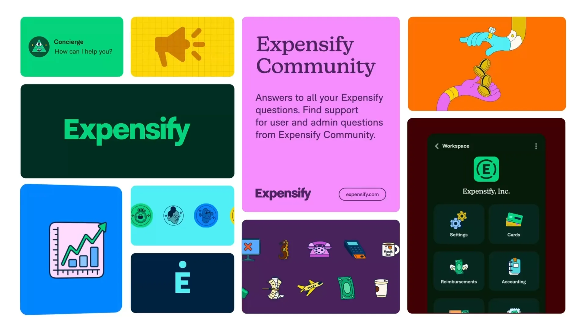
The Expensify rebrand gave the company a look that finally matches its personality: colorful, a little surreal, and fun to use. It’s a world where scanning a receipt can feel as good as popping a bottle of champagne.
The brand
The goal was to make the brand feel like the company actually is: playful, a little weird, and genuinely useful. Everything needed to hold up at every size, from a billboard on the highway down to a tiny app icon on your phone.
Typography
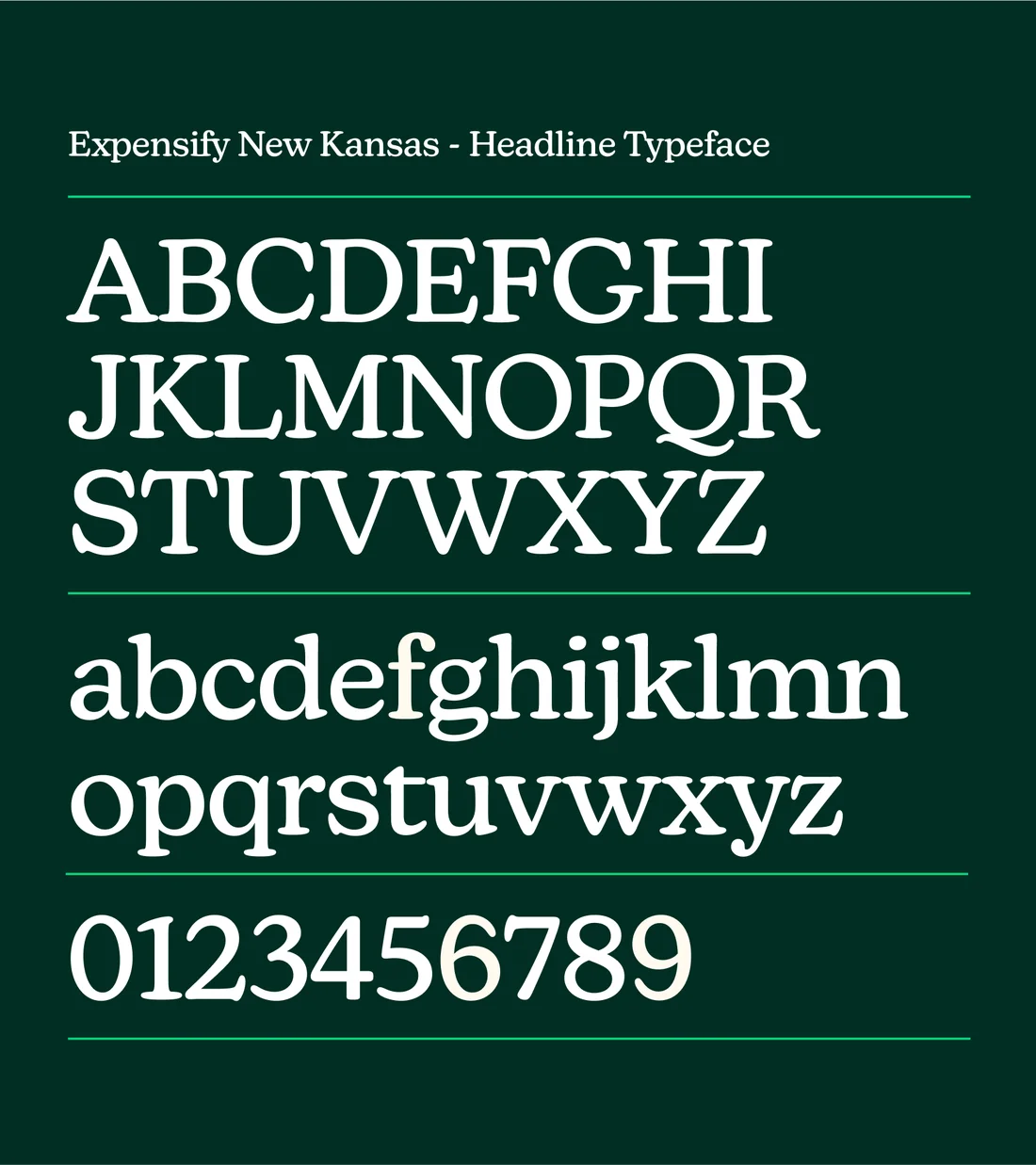
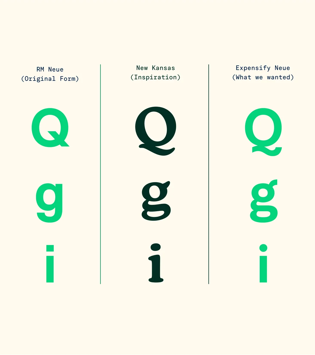
Type carries a lot of the personality. We worked with Newlyn on Expensify New Kansas, a characterful serif for the big moments, and with CoType on Expensify Neue and Mono to handle everything else. Together they give us plenty of range without ever feeling disjointed.
Color
We love a good dark mode, but the brand needed more color than that. The palette is built around Expensify green, with a clear set of rules for which colors pair together, so everything stays bold without getting noisy.
Illustration
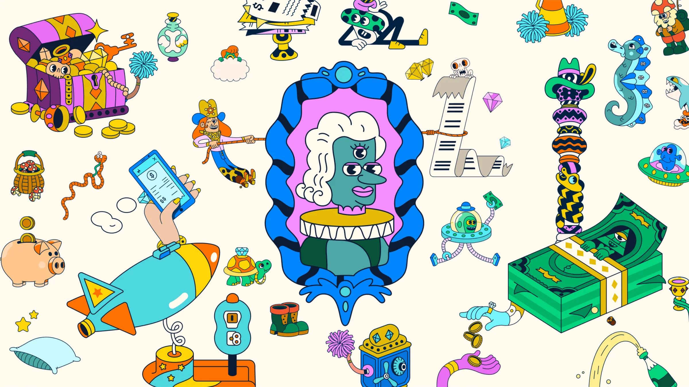
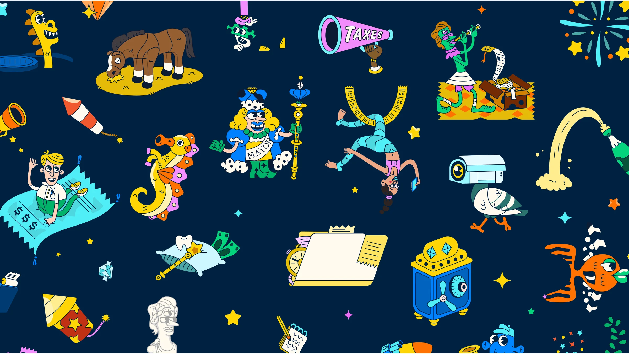
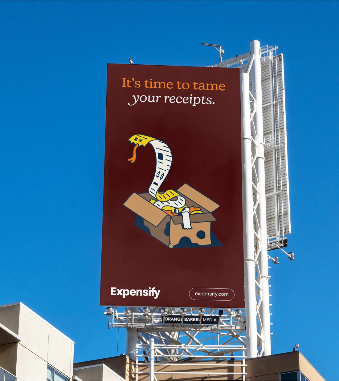
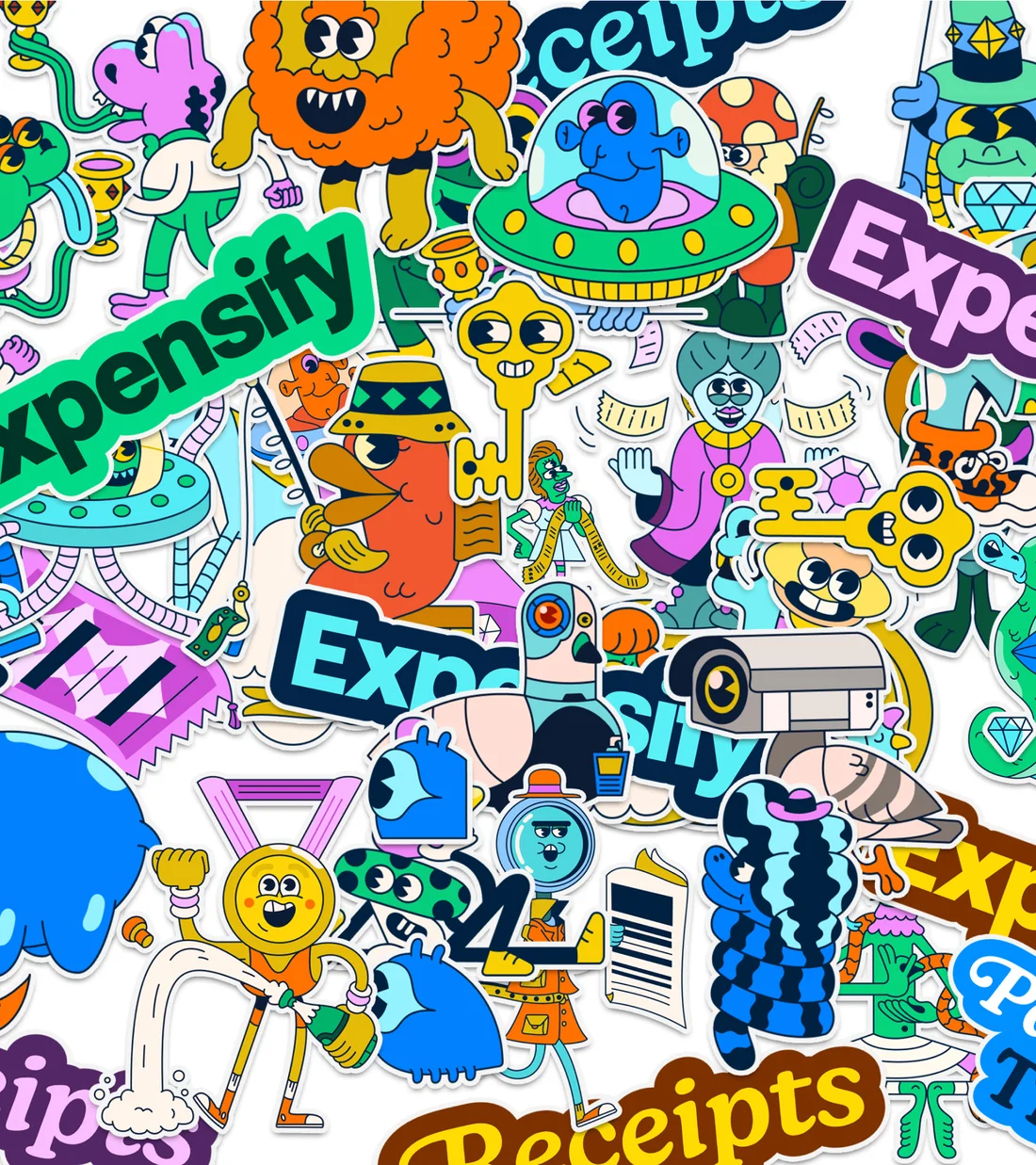
Our 2019 Super Bowl spot with Augenblick Studios set the tone for what Expensify could feel like. We teamed up with them again to build out a whole illustrated world, from big animated scenes to the little spot illustrations that show up throughout the app.
Iconography
Icons are the smallest expression of the brand, so the details matter. Each one is drawn on a 20×20 grid and borrows the same mix of sharp and rounded corners as the type.
Brand applications
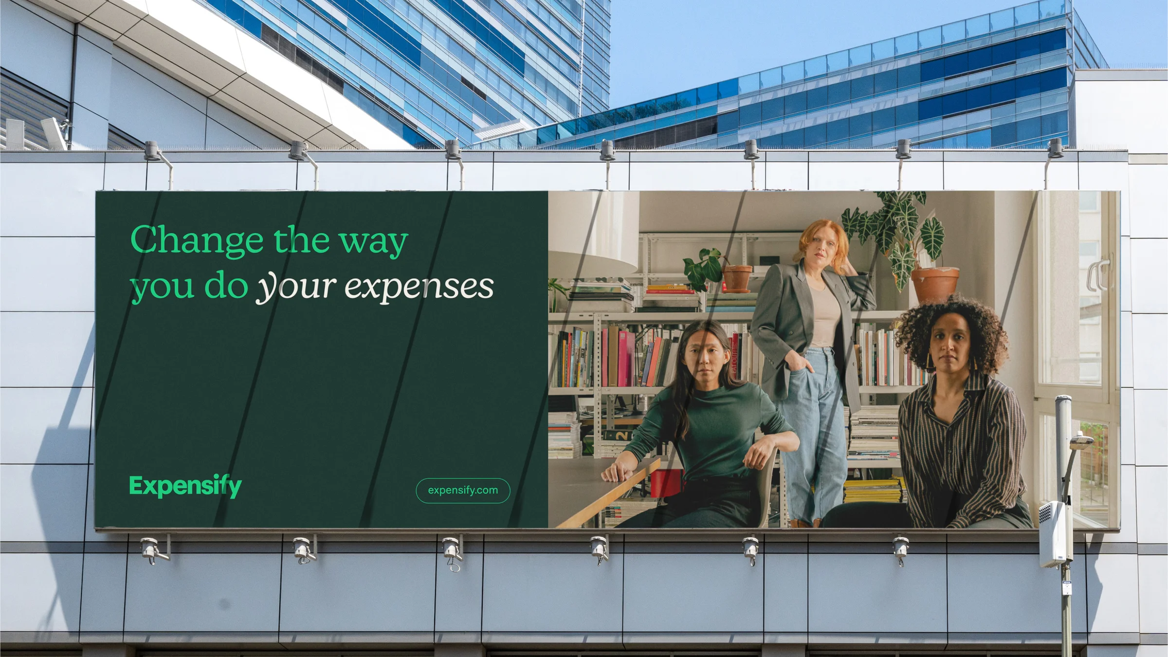
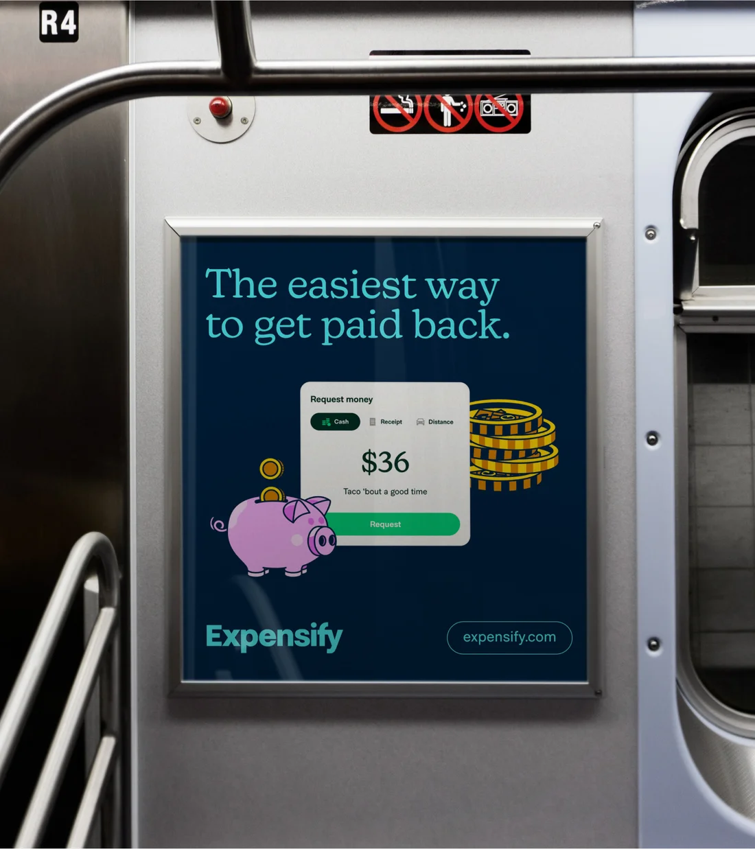
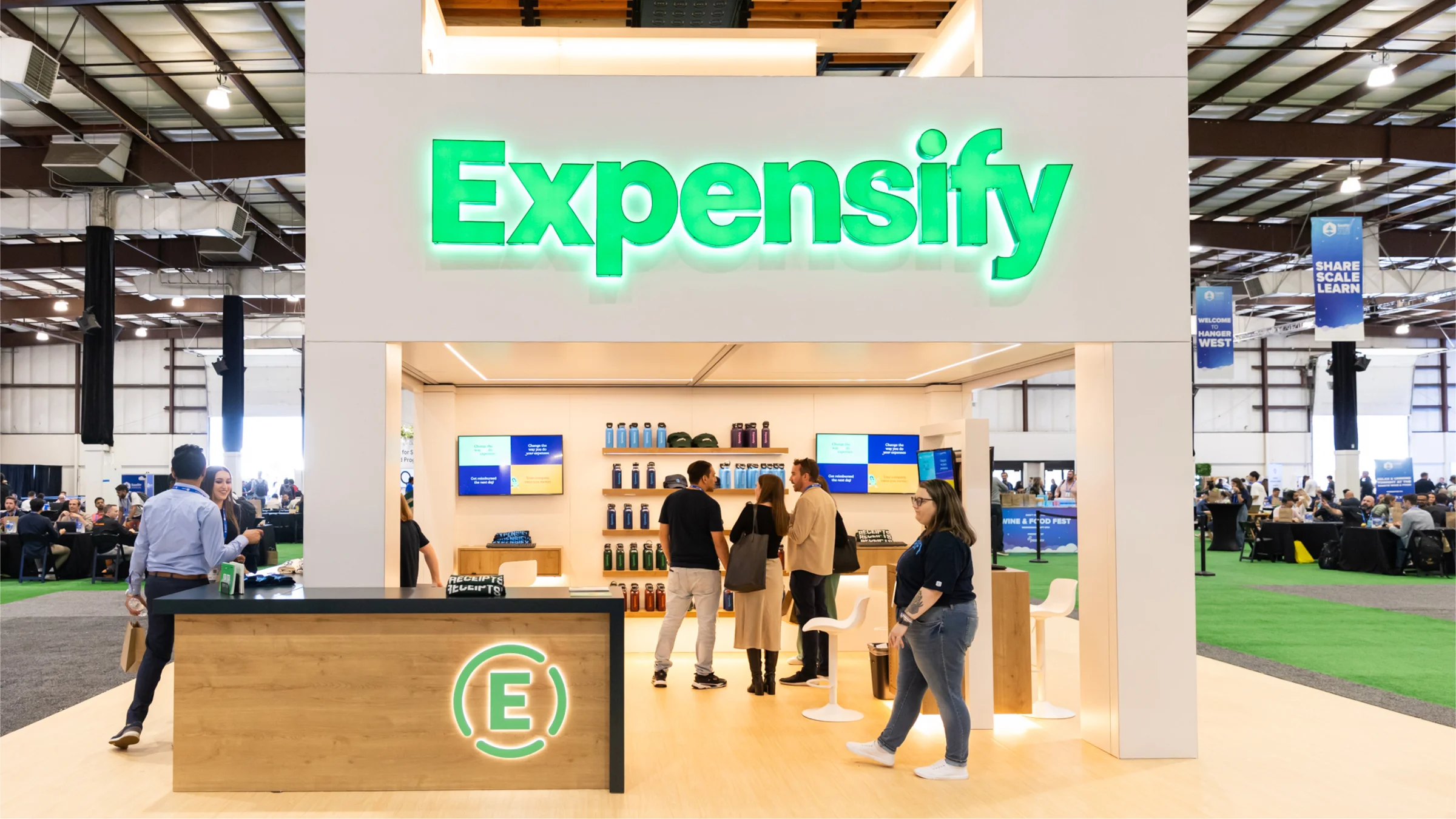
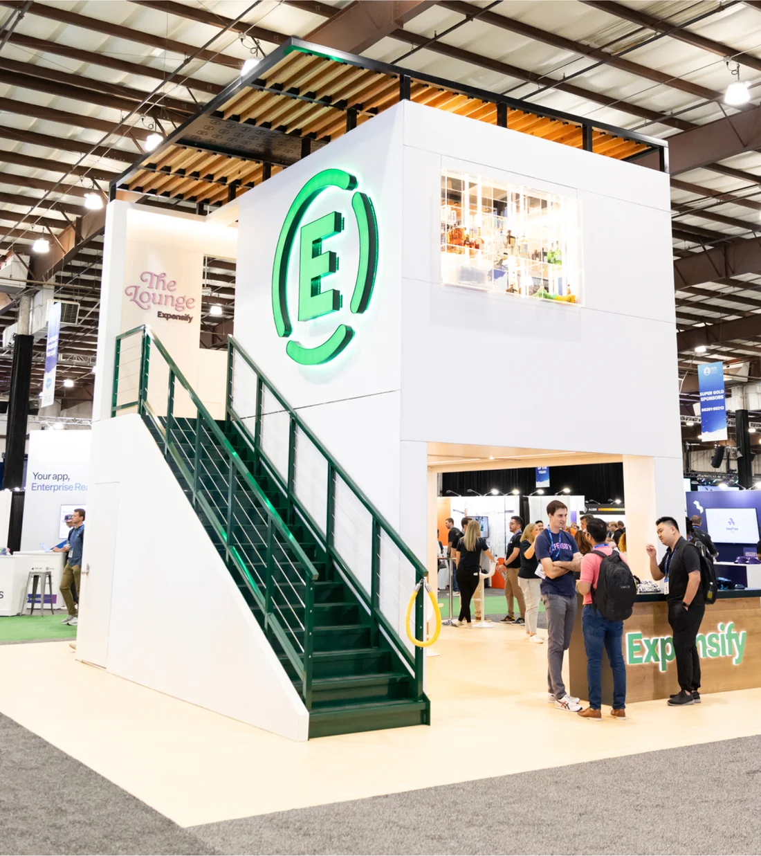
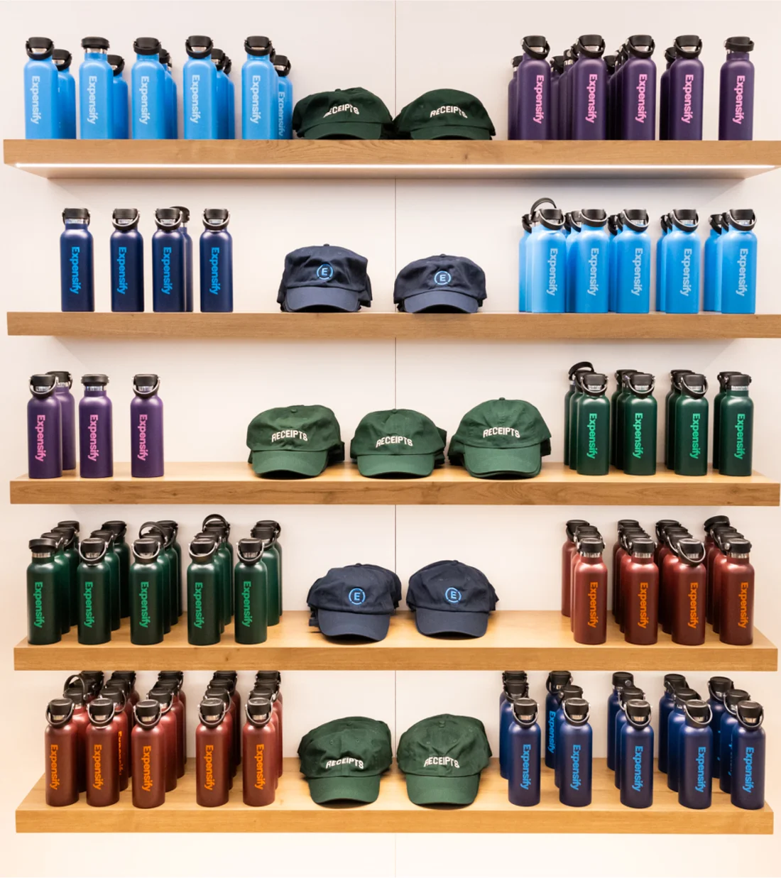
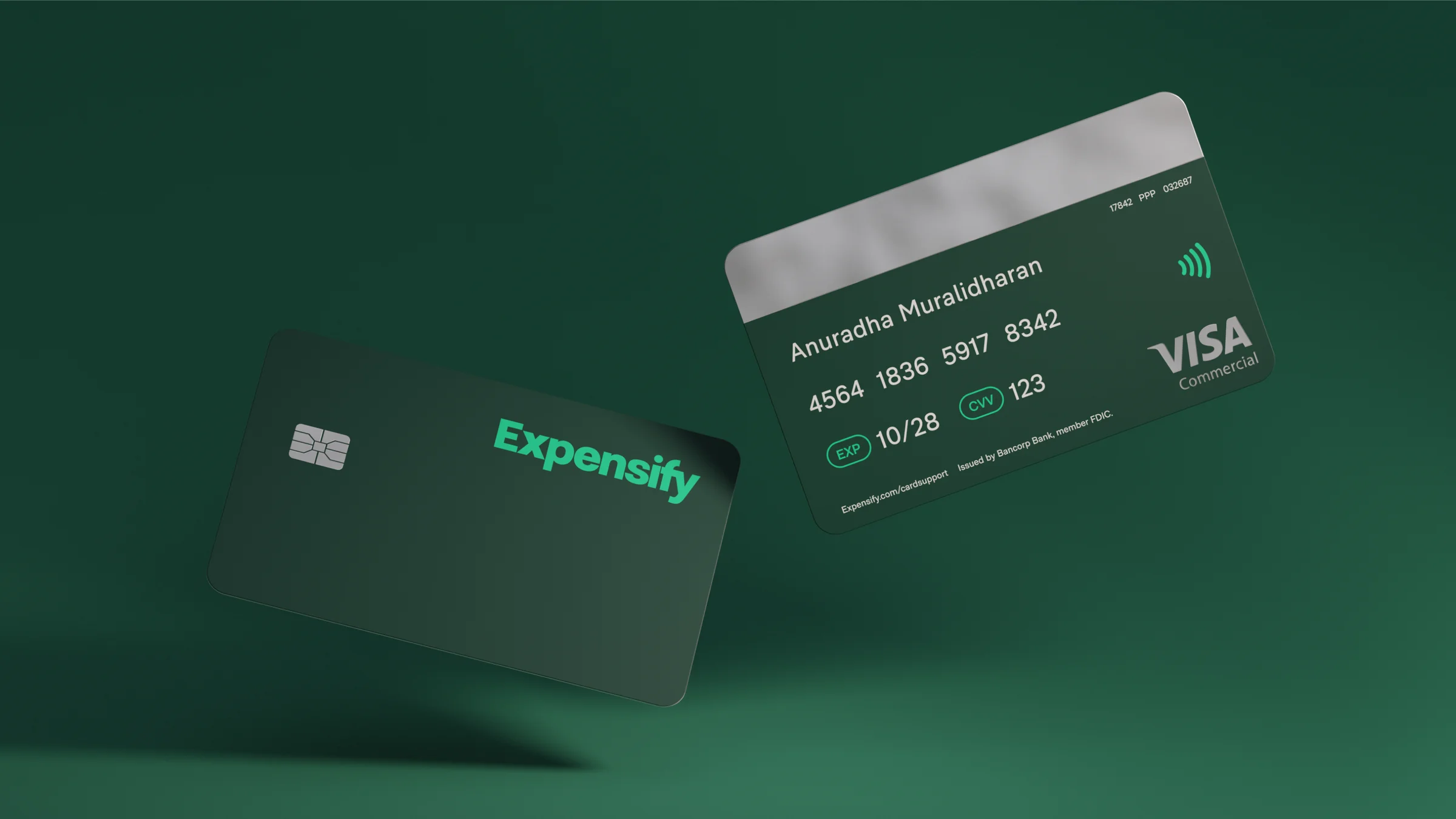
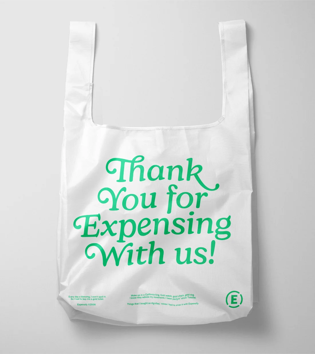
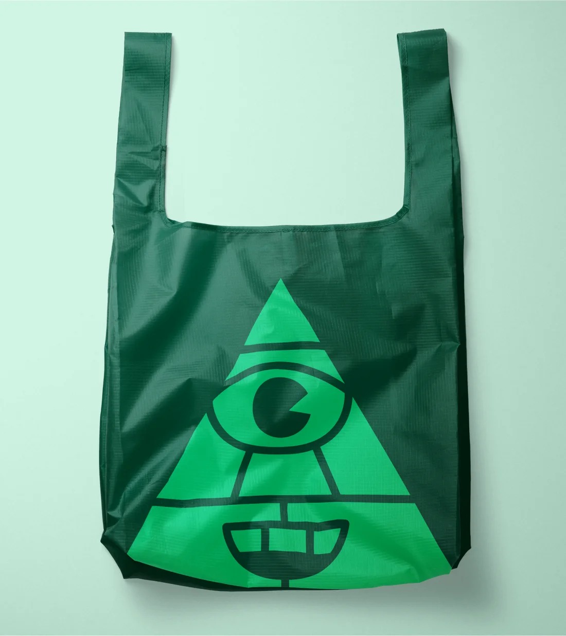
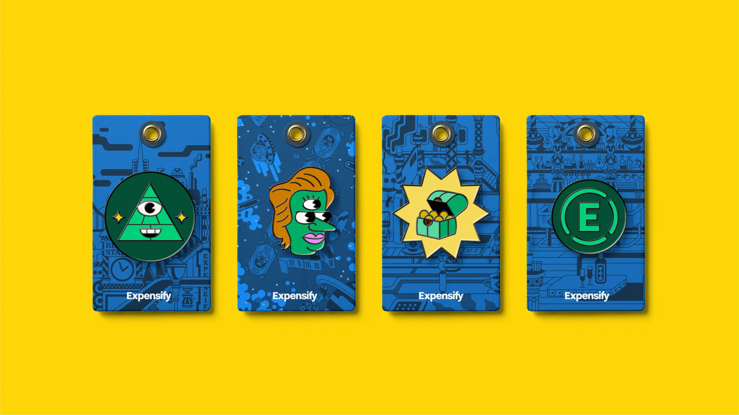
With the core pieces in place, it was time to put them to work. A small set of layouts scales from quiet to loud, which made it easy to go from billboards and social posts to conference booths and merch.

Product design
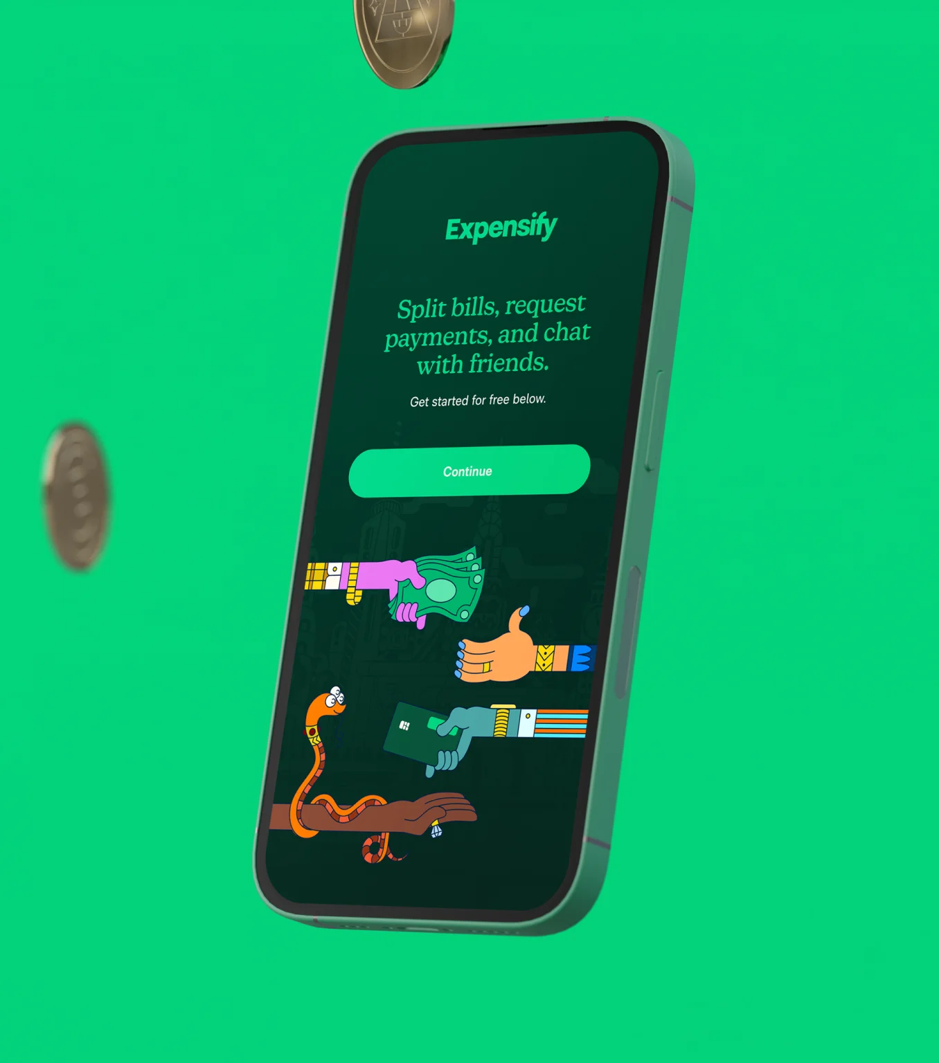
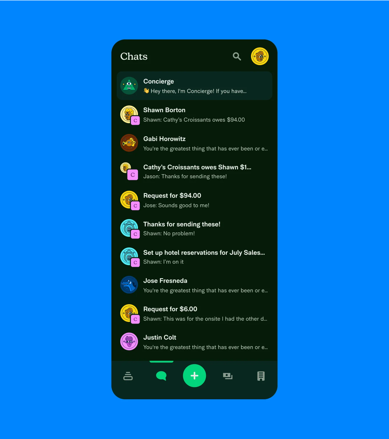
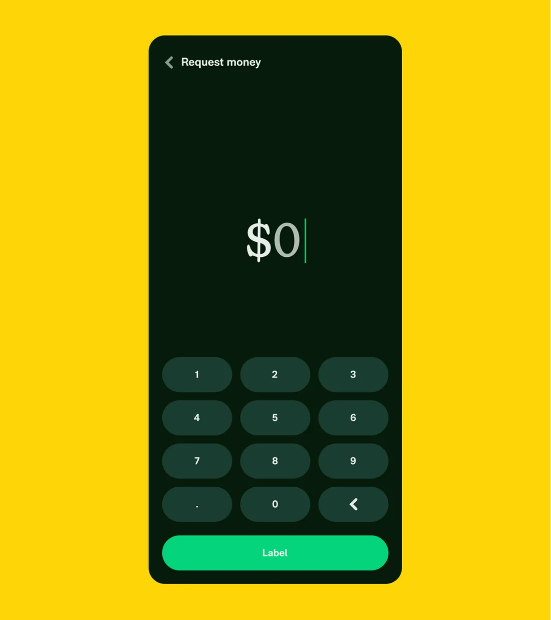
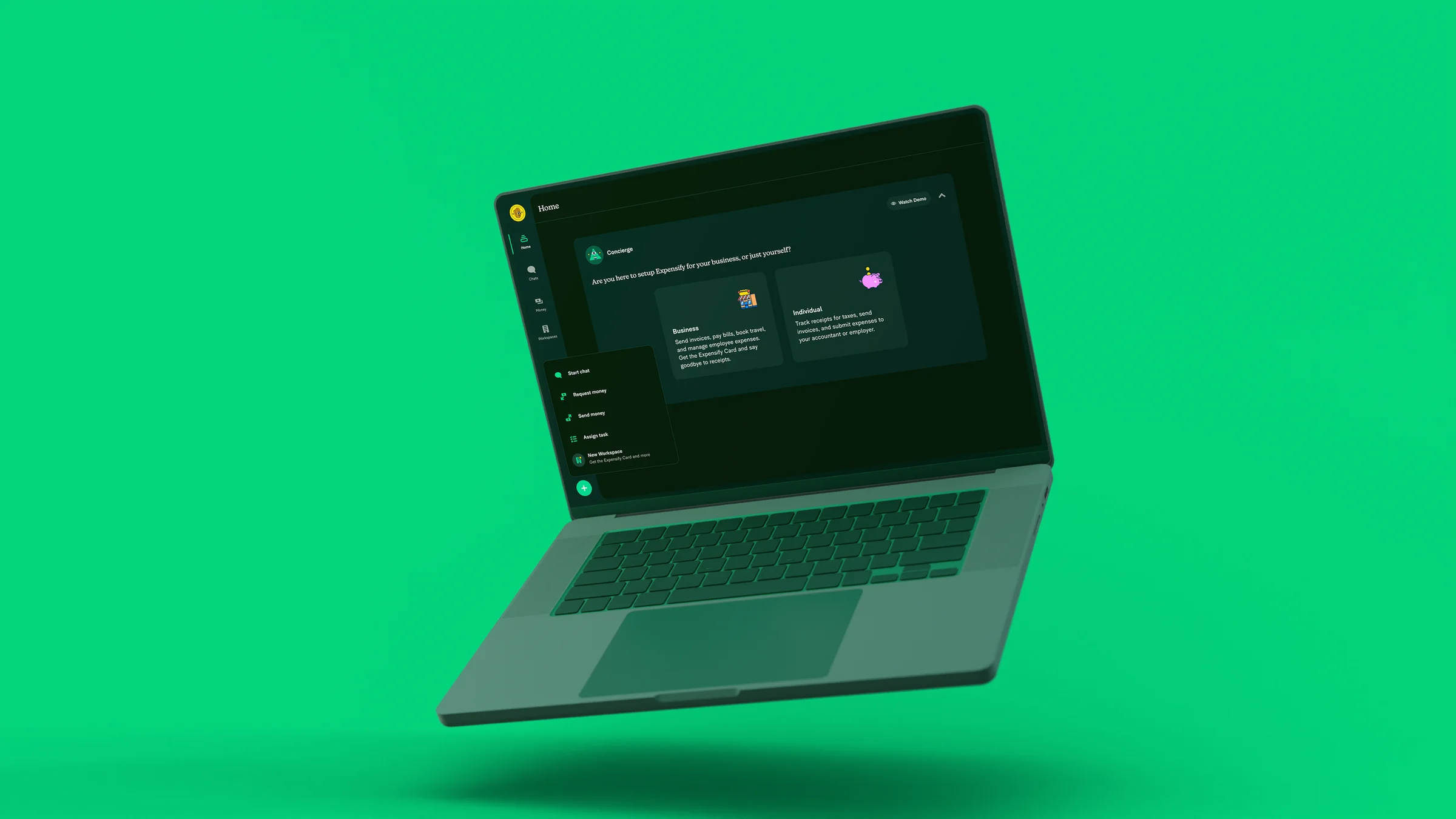
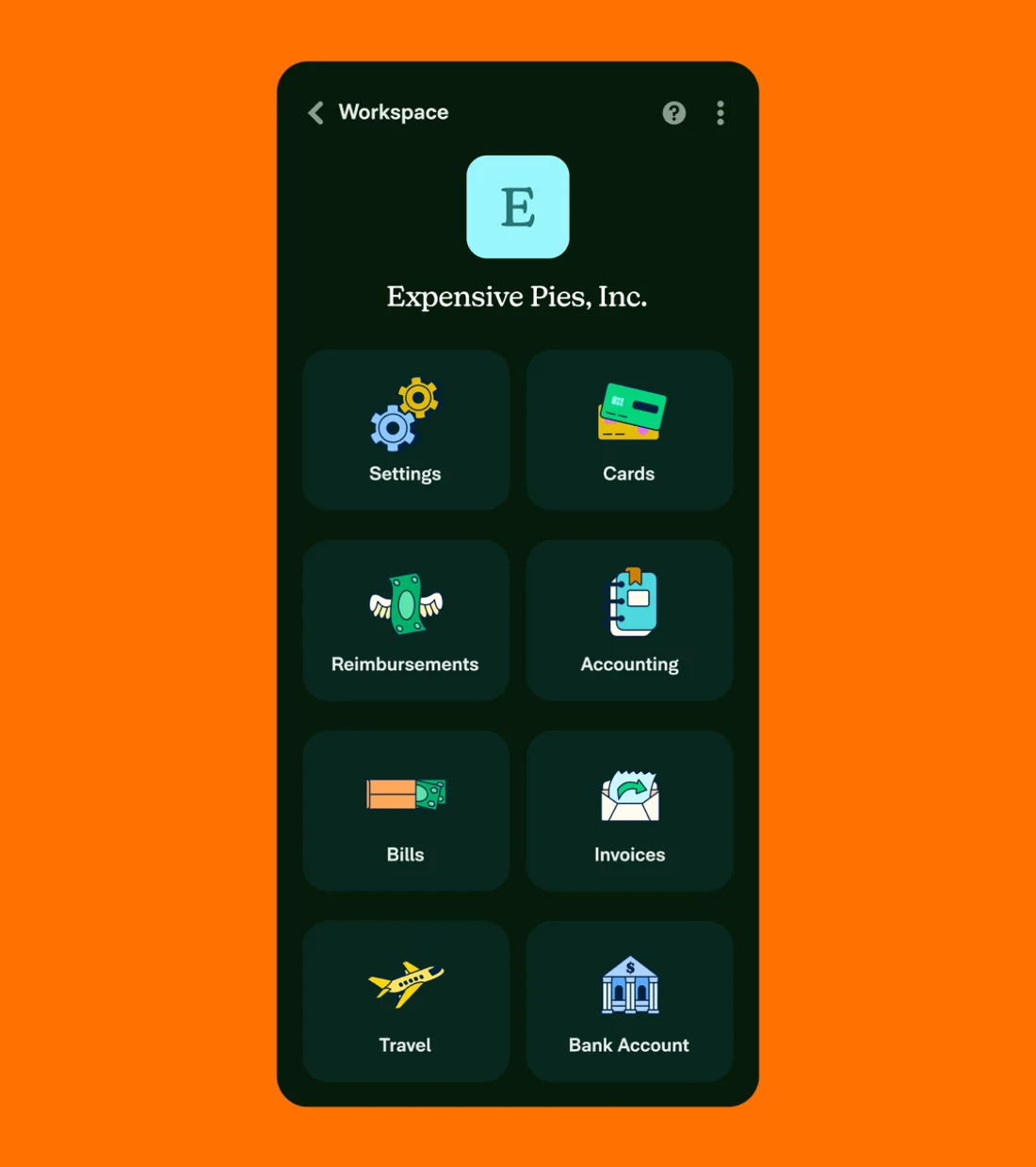
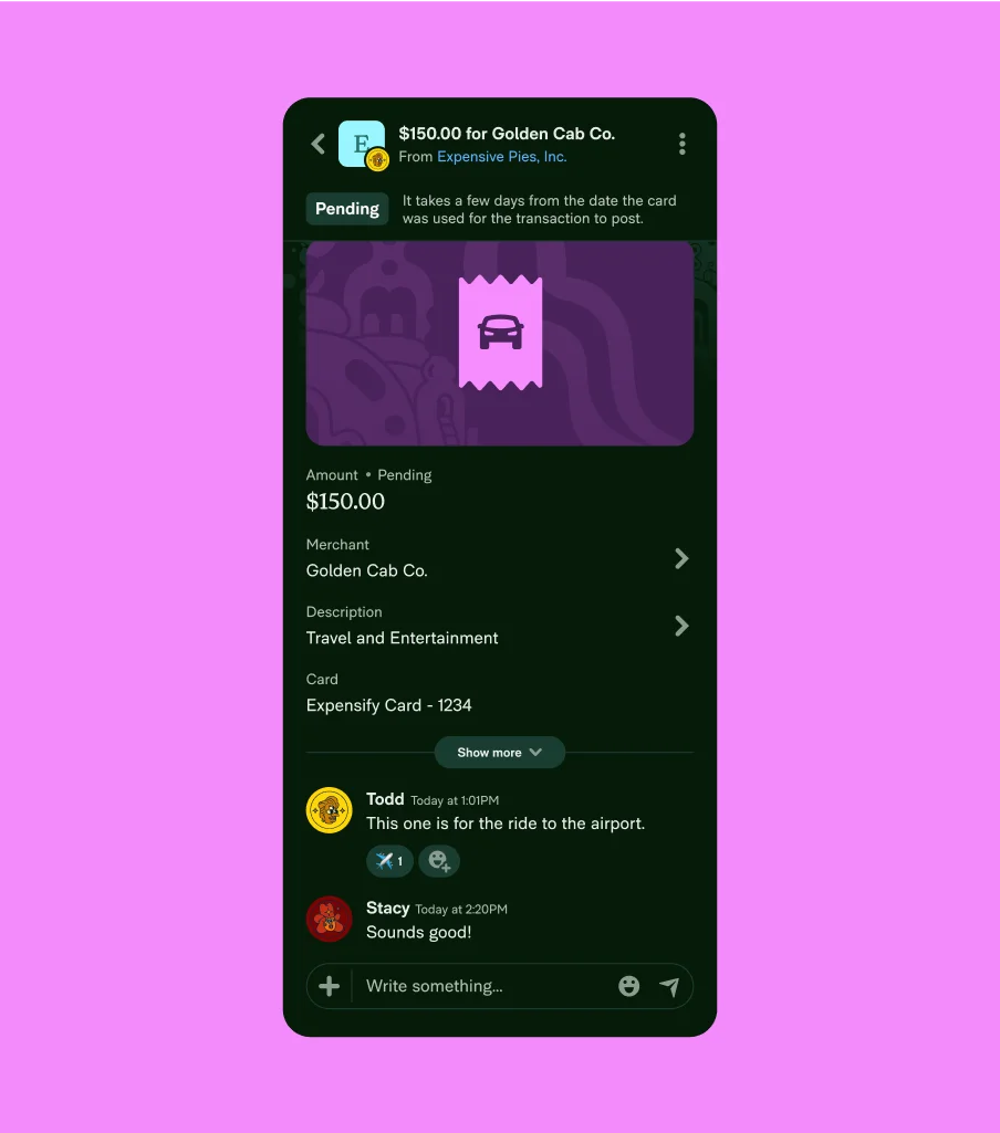
Last but not least, we redesigned the product itself. The goal was simple: using Expensify should feel as good as the brand looks.
The system
Put together, it’s a system the whole team can use to make things that look and feel like Expensify. We’re really proud of how it all came together.
Keynote
We introduced the new brand to the company at our retreat in Curaçao. Together with The Collected Works, I gave a keynote in front of more than 300 Expensifiers to walk through the ideas behind it. You can watch it below.
Credits
- The Collected Works
- Creative Direction: Jose Fresneda, Justin Colt
- Design: Christopher Skinner, Christian Townsend, Vincent Drayne
- Motion Design: Christopher Skinner, Justin Colt
- Case Study Motion Design: Yasmin Mukino
- Project Manager: Justin Raymond Park
- Augenblick Studios
- Illustration & Animation
- Newlyn
- Expensify New Kansas
- CoType Foundry
- Expensify Neue, Expensify Mono